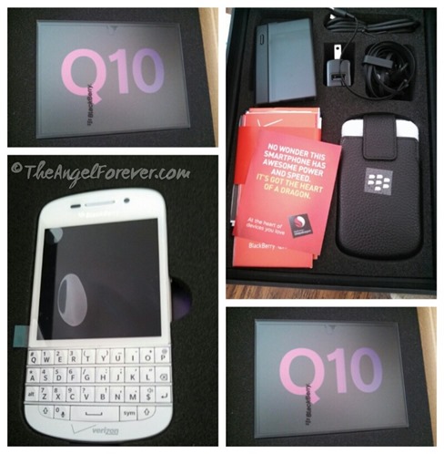
Hi all. TechyDad here, guest posting on my wife’s site. A couple of weeks ago, I was given a Blackberry Q10 as part of the Verizon Lifestyle Bloggers program. Even as I just began to use it, I could see some major improvements that it had over my previous BlackBerry Bold.
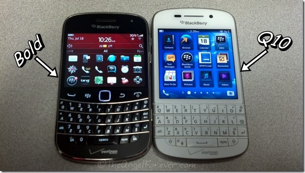
The first thing that I noticed was the outward appearance changes. The phone is a bit bigger. This is partly to accommodate a larger touch screen. In addition, while the Bold relied on a series of selection buttons and a touchpad “mouse”, the Q10 has eliminated both. Instead, the touch screen does all of the work. Swiping in various directions performs actions previously regulated to physical buttons. (More on this later.)
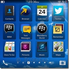
Next, I noticed that the Q10’s main screen resembles the screen on an Android or iOS smartphone. Apps are listed in a 3×4 grid with large icons on top and small (but still very readable) text beneath. The Bold would just show small icons. Yes, it wound up showing more per screen (18 to the Q10’s 12), but the drawback of an icon-only view is that it requires the user to know what each icon represents. At times, two apps can have icons that are confusingly similar. The text below really aids in figuring out which app you want to launch.
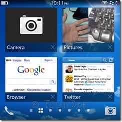
Third, the Bold wasn’t very intuitive as to how you needed to switch applications or close them when you were done. Eventually, I found out that I pressed the menu button from the home screen and chose Switch Application. I never did figure out how to close them, though. The Q10, by contrast, showed me how to app switch and close as part of its start up routine. From any screen, you simply swipe up. All of the running apps will be shown on the resulting screen as small screenshots with the app’s name and a close icon below. To close an app, you just tap the “close” icon and the app will be shut down.
Where swiping up gets you the running apps, swiping down gets you the settings screen. This gives you easy access to any setting on the Q10 that you might want to modify.
Taking screenshots are an additional improvement to the Bold. Previously, you needed to download a third party application. Now, however, you just press the volume up and down buttons at the same time and a photo of the screen will be taken immediately.
Finally, the BlackBerry Bold only had a rear facing camera. This meant that I could take photos of anything except myself. (Unless, of course, I turned the camera around and hoped that I was angling it properly.) The Q10, on the other hand, has both a front and rear facing camera. This means that video conferencing applications, such as Skype, are possible on the Q10. For a business phone, this can be invaluable as a simple conference call can be enhanced with video capabilities.
With all of these new features, the Q10 has left me itching to dive deep and see just what this phone can do. More is definitely to come.
Disclosure: As a member of the Verizon Lifestyle Bloggers, I recently received a BlackBerry Q10 to test out and share ways that I use my cell phone to make life easier. There was no other compensation. I am a long time Verizon customer, and all opinions are my own.

